Trend Fusion Oscillator
One of ChartPrime’s most iconic oscillators, this tool combines price and volume to provide market participants with valuable insights into potential future price action. It’s designed in a classical oscillator format for familiarity and ease of learning.
It consists of several key components:
1. Trend Mode
The Price Volume Oscillator uses an adaptive calculation to indicate when the market is entering a downtrend or uptrend. When the oscillator intersects with the adaptive plot, the color of the price volume band changes—green for an uptrend and red for a downtrend.
 |
|---|
| The Fusion Trend Wave showing market direction |
2. Divergences
The TMO identifies two types of divergences:
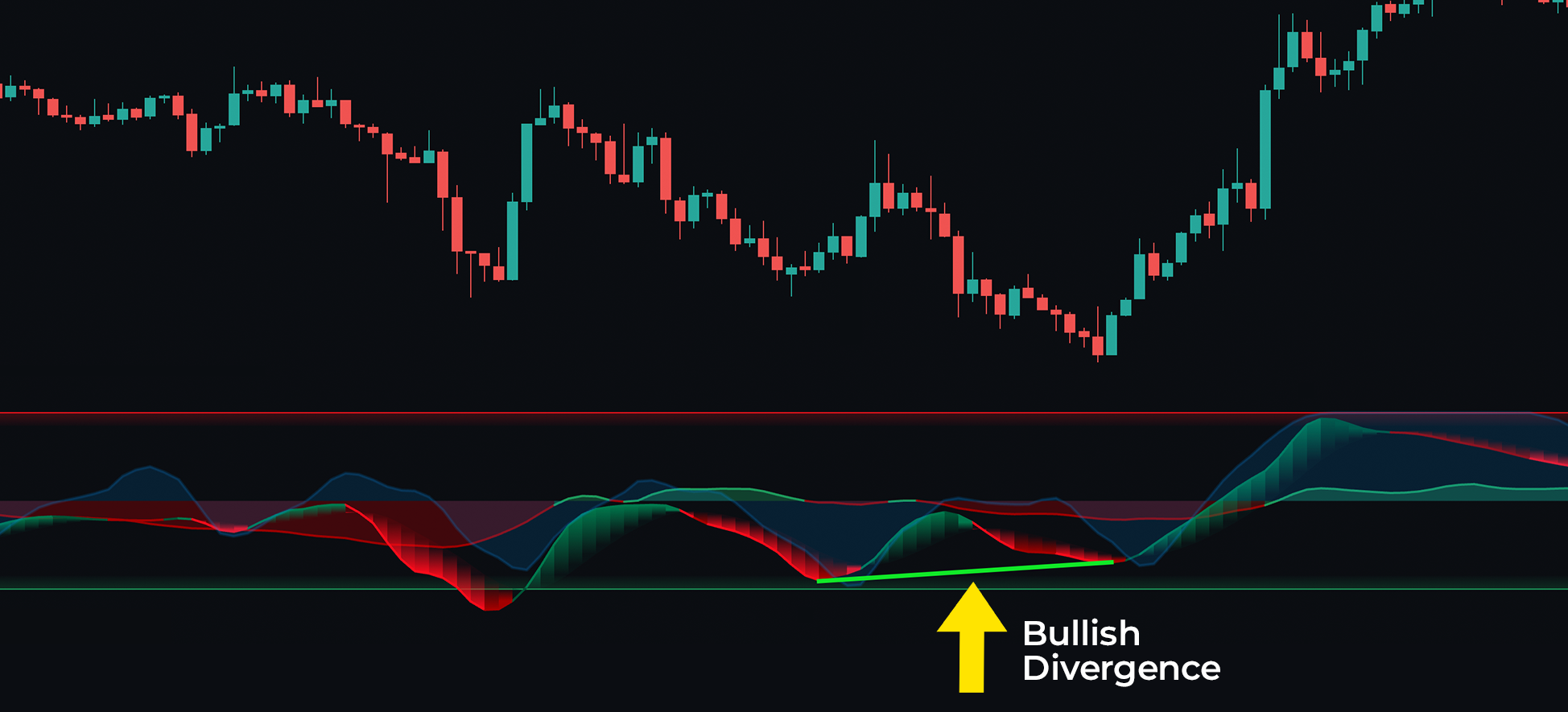
Regular Bullish Divergences: Occurs when the price forms lower lows while the oscillator forms higher lows, signaling a weakening downward trend and suggesting a potential upward reversal. Despite falling prices, the oscillator’s higher lows indicate diminishing bearish momentum.
Regular Bearish Divergences: Happens when the price creates higher highs while the oscillator makes lower highs, signaling that the upward trend is losing strength and could reverse into a downtrend. This is often seen as an opportunity to short or exit long positions, as the bullish momentum is fading.
 |
|---|
| Bullish Divergence shown on the Fusion Wave |
When the peaks and valleys of the Price Volume Oscillator ribbon diverge from price action, a thin line connects the diverging points, indicating a higher probability of reversal. These divergences can be used in a classical trading fashion.
For example, a red line connecting two peaks suggests an imminent price reversal, while a green line connecting two bottoms indicates a potential upward bounce.
3. Areas of Reversal
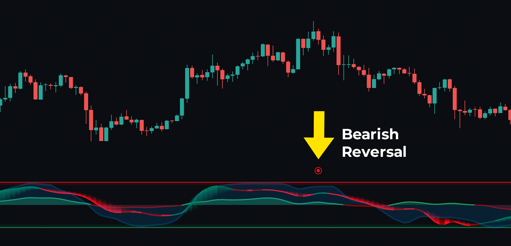
These signals use an algorithm that factors in the median length of trends, average true range, price deviation, volatility, and gap conditions to highlight areas with a high probability of reversal. These reversal signals are clear and effective when used alongside other factors. Shown as red and blue dots, a red dot signals that momentum and money flow are exhausted, potentially indicating a pullback or bearish reversal. A blue dot suggests a bullish bounce is likely.
 |
|---|
| Reversal Dot forecasting Bearish Reversal |
Always look for confluence and set sensible stop losses when trying to scalp reversals in markets. Predicting perfect market bottoms isn't a reasonable goal.
MFI
In the background, there’s an MFI histogram that shows the market’s money flow. A green histogram indicates bullish buying pressure, while a red histogram signals that sellers are entering the market.
Confluence Trading With The TFO
When using the TFO, building confluence between price action and the volume components of the oscillator is crucial. For example, when both the MFI and the main wave are positive, it strengthens the case for a long position. This oscillator is a powerful, all-encompassing tool, effective on its own.