TradeIQ Kit
The TradeIQ Toolkit is a unique and powerful collection of indicators designed to enhance your trading experience. Combining advanced support and resistance methods with robust signals and a range of additional features, this toolkit stands out as one of the most sophisticated options available for traders.
Created in collaboration with ChartPrime, this documentation covers each component to help you maximize the potential of your toolkit.
Main Toolkit Features
Signals
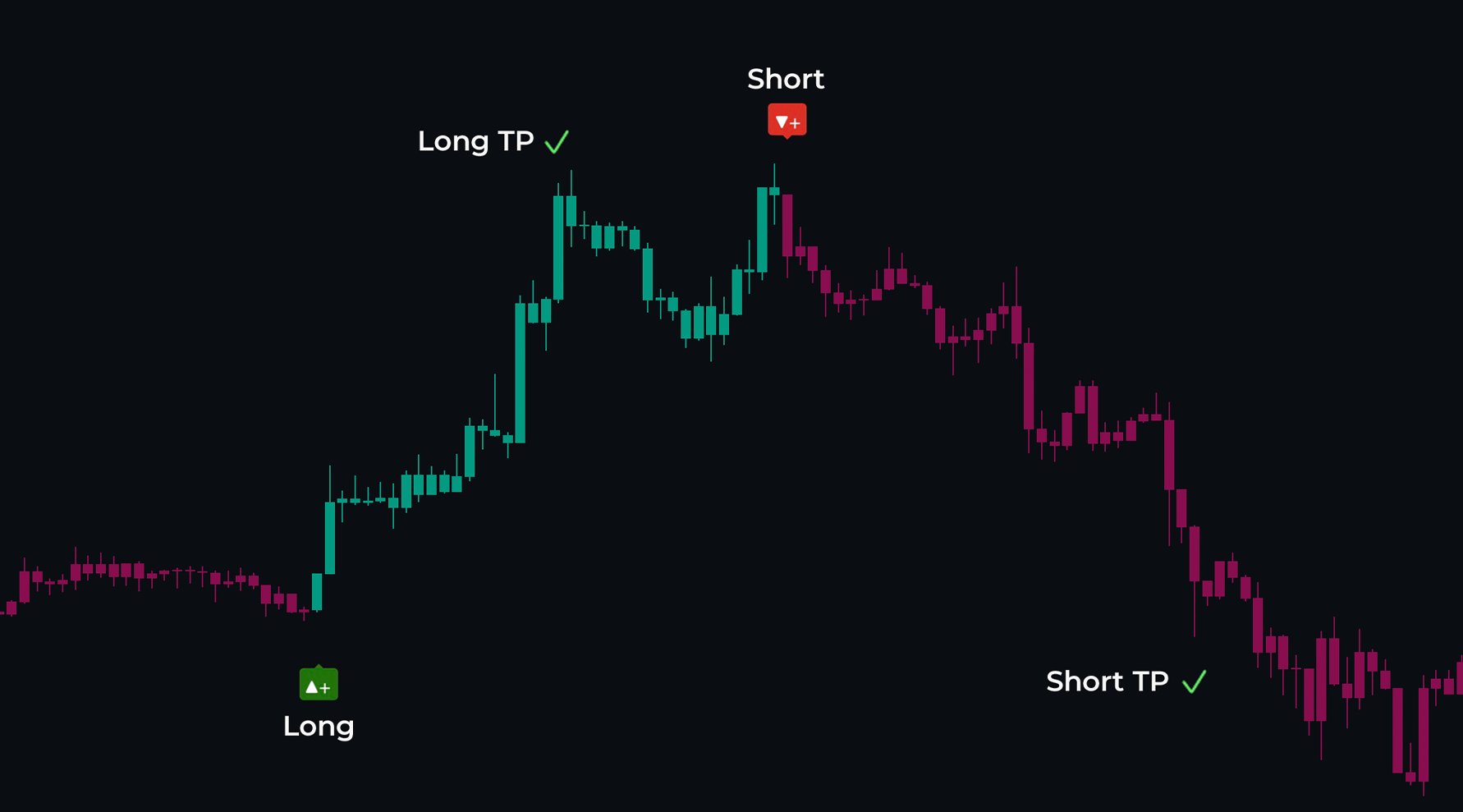
The TradeIQ Signals offer a fresh approach by clearly displaying take profit (TP) and stop loss (SL) levels directly on your chart. These signals are trend-based and are generated when the price begins to reverse. When a trend reversal is detected, two main components are produced:
- The signal itself.
- The TP & SL levels.
There are two primary signal types: Long (indicating a potential price rise) and Short (indicating a potential price drop).
 |
|---|
| Signals with Target Profits |
As the price progresses, take profit signals are generated to guide your exit strategy. You can adjust the distance of these TPs using the TTP setting; a value around 3 is generally healthy.
More On Signal Settings
Sensitivity: Adjust how frequently or sensitively signals are generated. Lower values produce smoother signals, while higher values yield more trades.
Shadow Feature: Helps with trend identification by providing additional visual cues.
Always look for additional confirmation when trading with signals; avoid making trades blindly.
The toolkit includes colored candles that complement the signals, available in two modes: Trendy and TIQ Alpha. Trendy candles reflect classical trend-following colors, while TIQ Alpha candles focus on market momentum and money flow, resulting in a clean blue and purple color scheme.
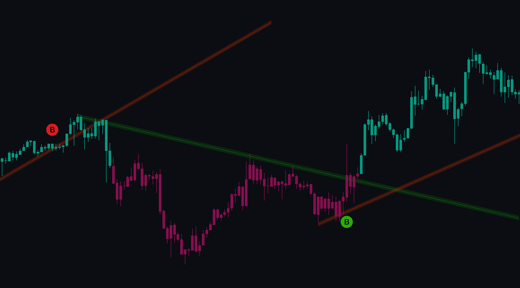
Trendlines with Breaks
Trendlines are essential tools for traders, providing insights into support and resistance levels and overall trends. You can enable trendlines in the TradeIQ toolkit by navigating to the Trendlines setting and turning it on. This simple setting draws trendlines when there are two confirmed touches.
 |
|---|
| Trendlines with “B” tags suggesting a change in trend |
Traders can adjust how macro or micro the trendlines are via the scale drop-down. Traders seeking longer-term trendlines might want to select Macro trendlines, whereas a trader looking for short-term areas of support or resistance would want Micro. Users can also toggle on historical trendlines using the records input and can adjust how the trendlines are drawn, either from the wicks or body of the candles.
When a trendline is broken and a trend change is identified, a B label is made. These can confirm the trend has changed direction. E.g., a red downwards trendline with a green B would confirm the market is now in an uptrend.
Green trendlines generally act as resistance, while red trendlines serve as support levels.
When a trendline is broken it can switch from support to resistance.
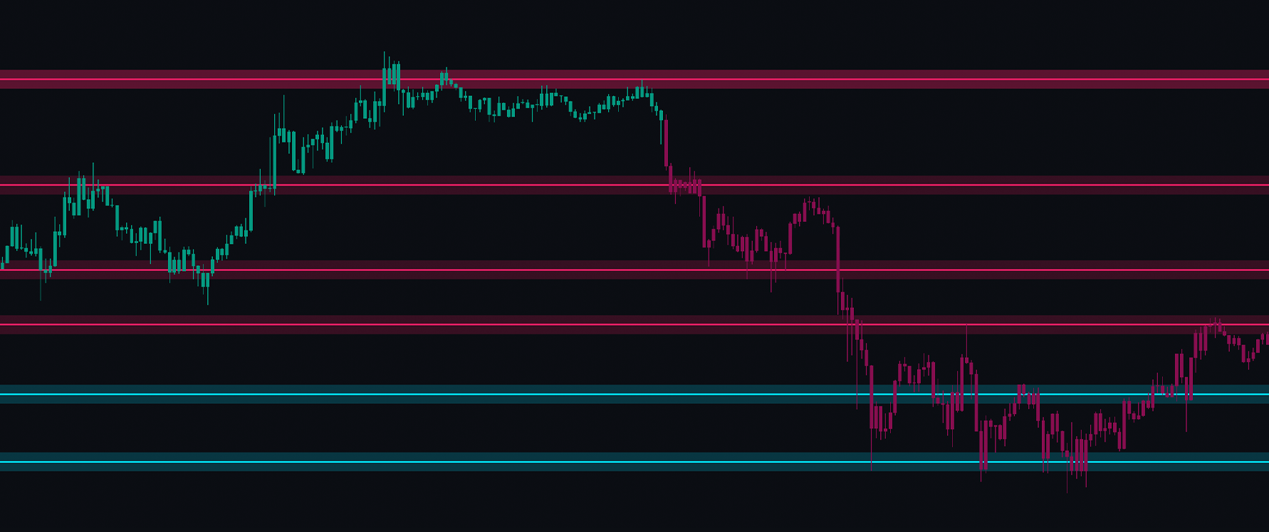
Support And Resistance
These can be enabled via the settings. Traders will immediately notice blue and pink support and resistance levels. When the price reaches these levels, a bounce is likely. If the price is above the zone, it indicates that buy orders are placed there, acting as support. Conversely, if the price is below this zone, it likely contains sell orders, acting as resistance.
 |
|---|
| Support and Resistance bounces |
Users can also see the values of the higher and lower levels as labels, which make excellent take profit or stop loss points in trading. The color of these levels and the maximum number of zones displayed can also be adjusted.
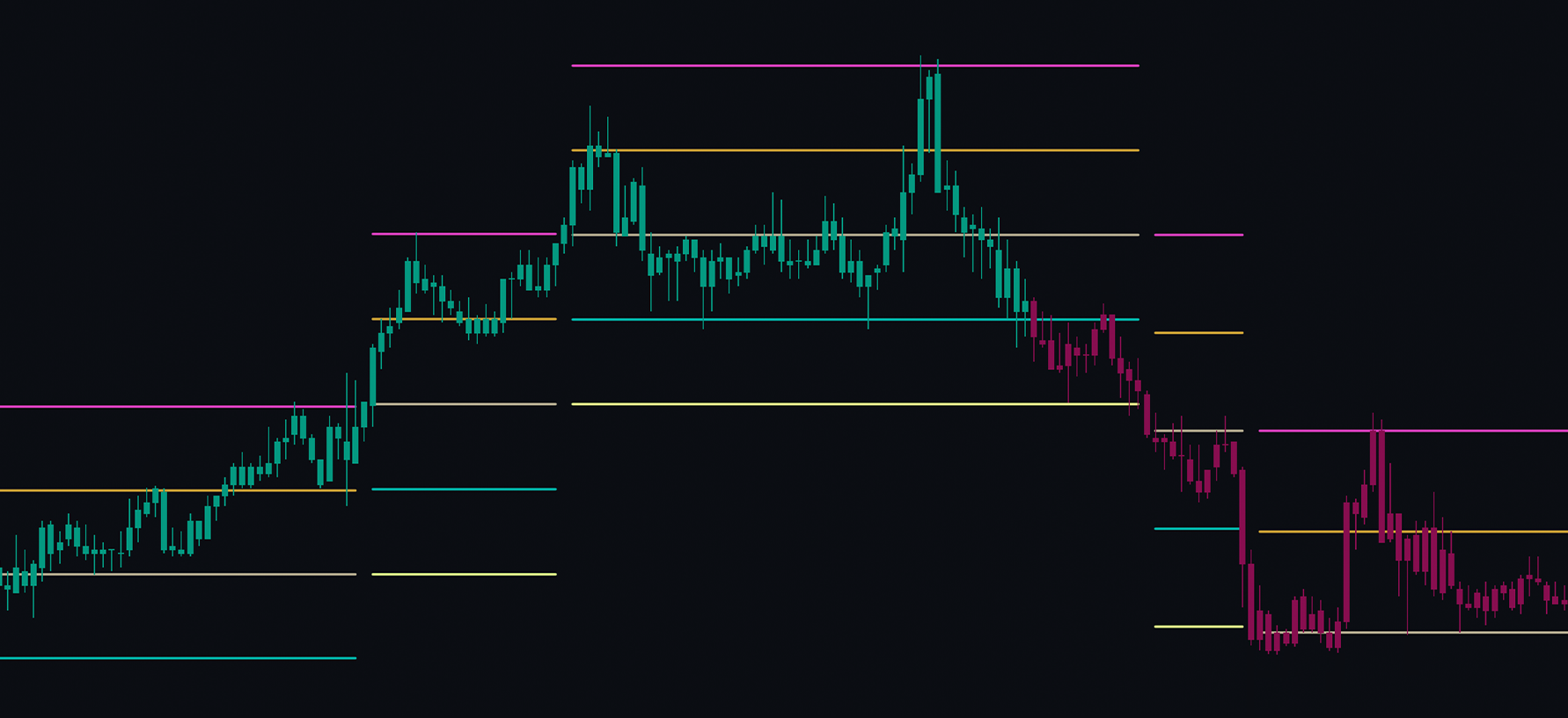
Predictive Ranges
The Predictive Ranges provide a real-time price action range on the user’s chart. The price may find support and resistance at these levels. Traders can adjust the length used to detect the range; the default is 50 bars, but users looking for more frequent ranges can reduce this to 10-20. Generally, these ranges offer excellent suggestions for stop loss and take profit levels in the market.
 |
|---|
| Predictive Ranges acting as Support and Resistance |
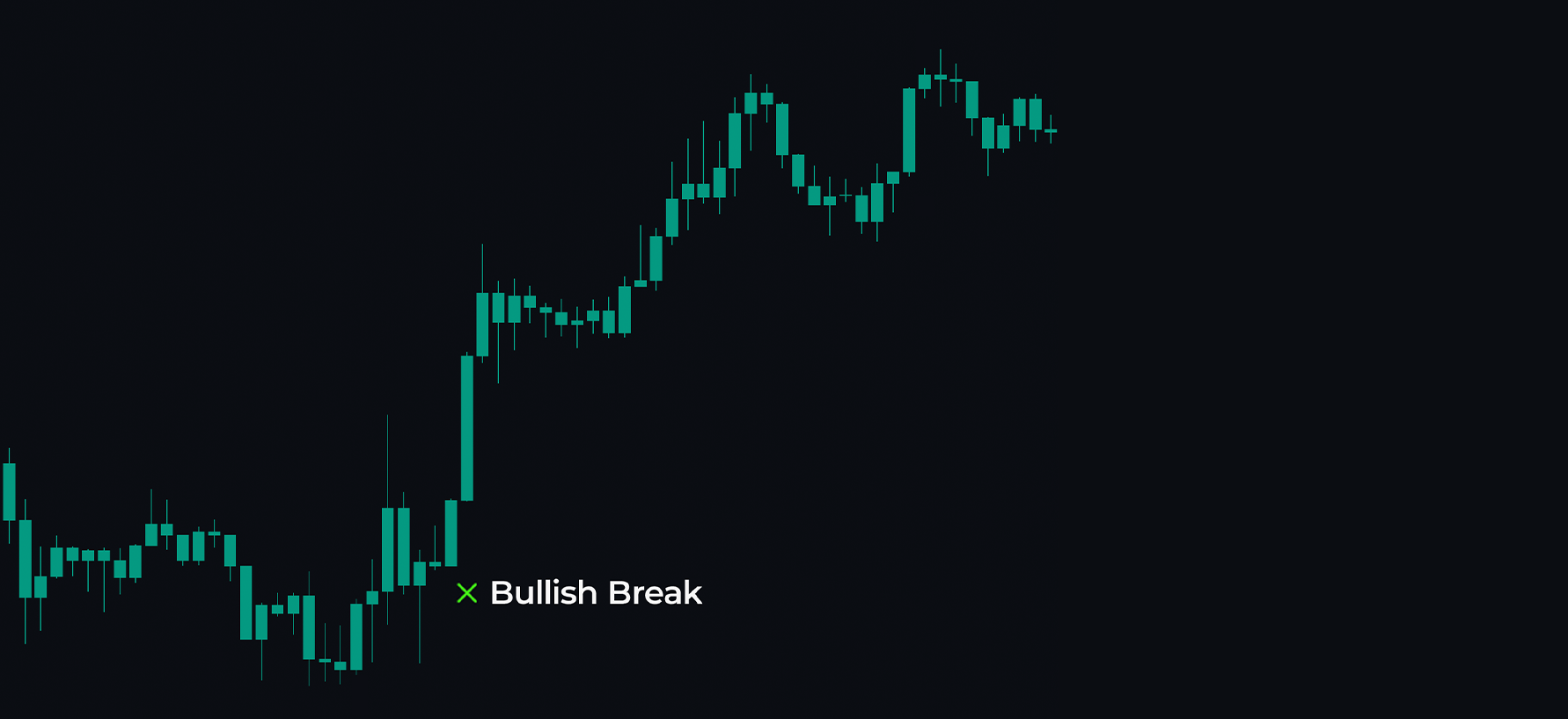
TIQ Breaks
TradeIQ’s Breaks display X marks on the chart where market structures have been broken. This feature takes popular SMC concepts and presents them clearly on the chart. Red X marks indicate bearish price action and suggest that areas of support or pivots in the market are being broken downwards. Conversely, green X marks signify bullish breaks of market structure.
Traders can use these levels as confluence in their trades and can also cautiously consider them as signals in their trading.
 |
|---|
| Bullish Market Breakout |
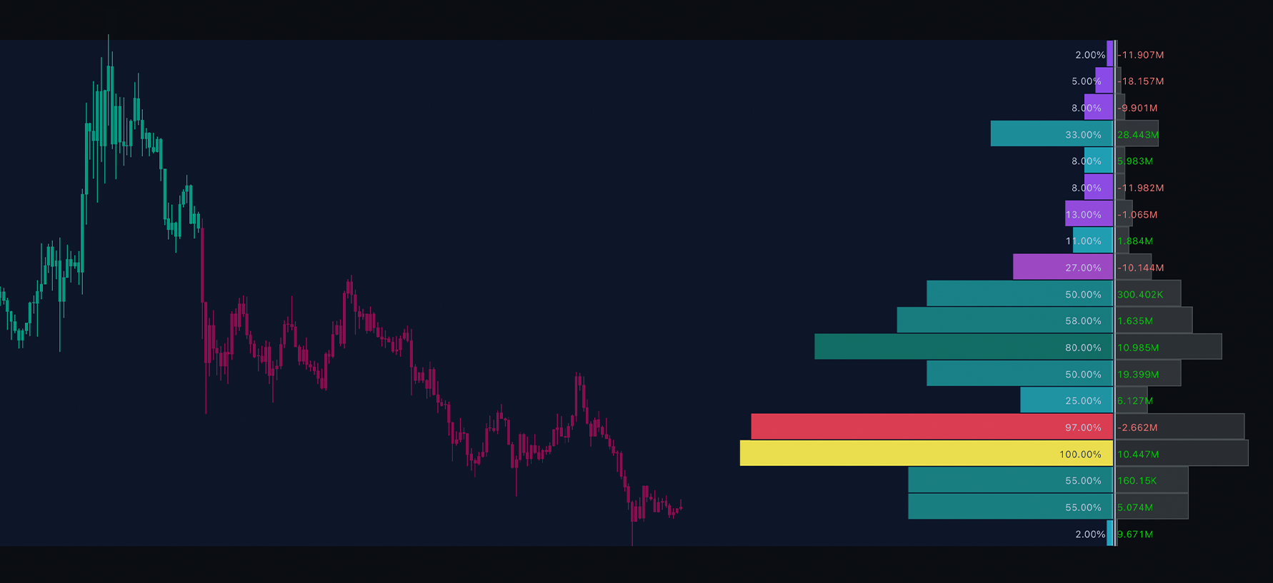
TIQ Profile
The TIQ Volume Profile is designed to provide deeper insights into volume analysis. The left side of the profile shows the relative percentage of volume at each level, while the right side displays the actual traded volume. A green value indicates net positive buying volume, while a red value suggests net selling, making it a bearish level.
In the settings, users can customize this profile. The length input allows users to adjust how many bars the profile analyzes; by default, it scans 250 bars for volume data. Users can also change the profile’s position and adjust the number of bins or levels. A user seeking more granular data can increase this value to split the market into more components.
When using volume profiles, it can be advantageous to look for peaks in volume activity. Identifying these peaks can reveal significant areas of support or resistance in the market. Conversely, low-activity zones can provide valuable information; a low-volume zone may indicate that the price won’t respect support and resistance in that area, essentially creating a “no man’s land.” Be cautious when trading in low-volume areas.
 |
|---|
| Readings on the Volume Profile |
Using the settings, a histogram can also be toggled on to break down the volume for each bar, as well as a moving average. This moving average can help detect volume breakouts in the market.
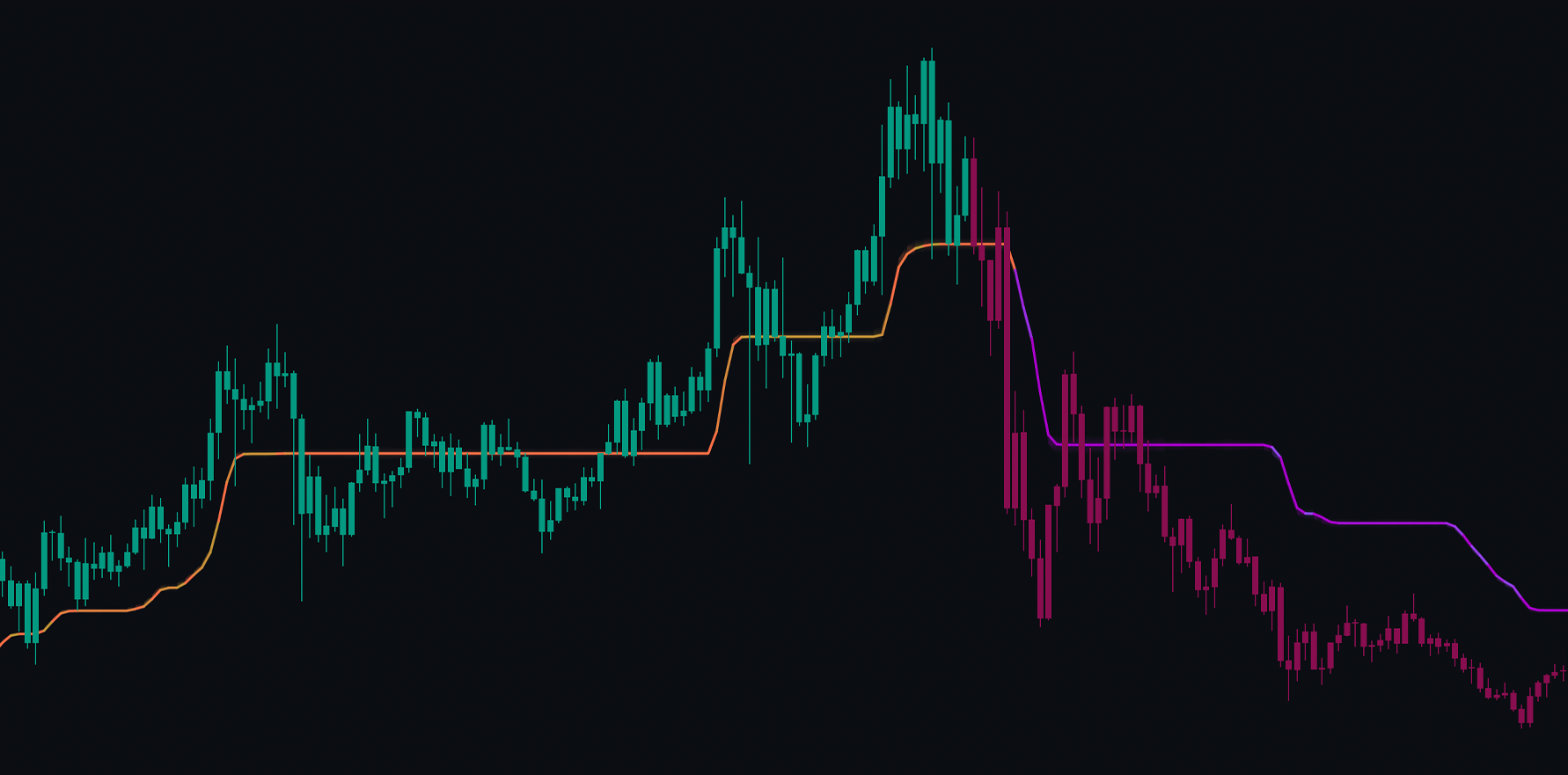
TIQ Tracer
The TIQ Tracer provides powerful trend-following confluence for traders. Orange colors indicate an uptrend, while purple signifies a downtrend. This tool can help filter signals and also serve as a fantastic support and resistance zone where prices often bounce. Users can utilize MTF functionality to bring in data from other timeframes onto their chart. By using the dropdown menu, users can display the Tracer on other timeframes, adding further confluence.
 |
|---|
| Readings on the Volume Profile |
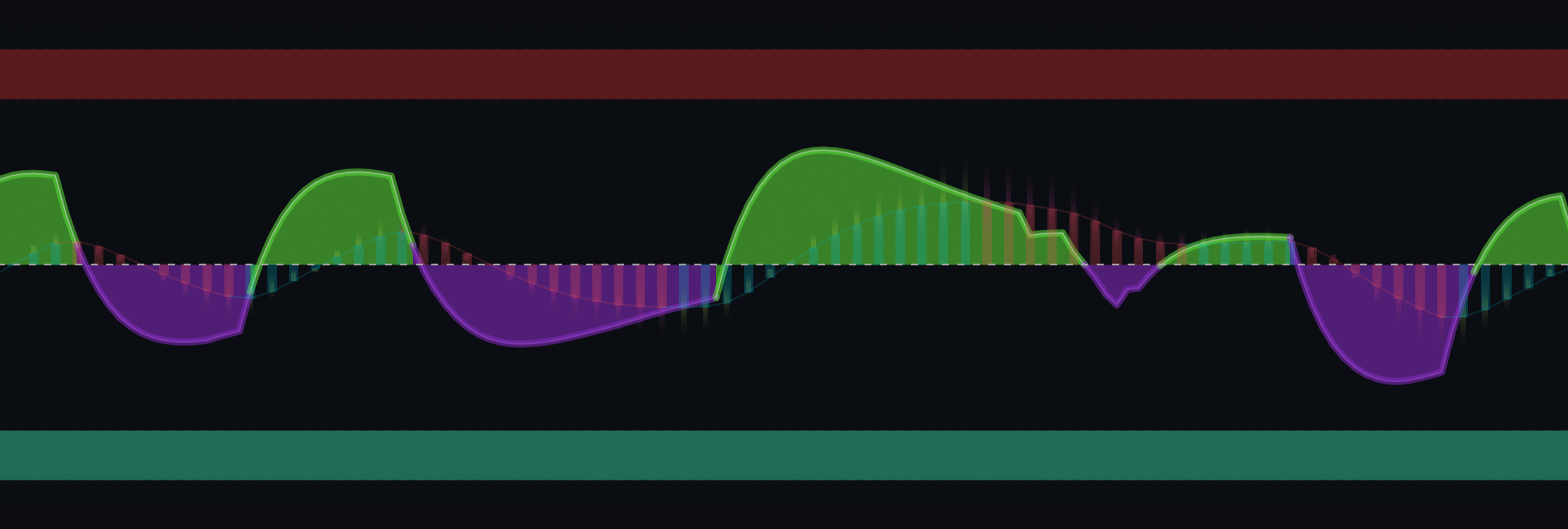
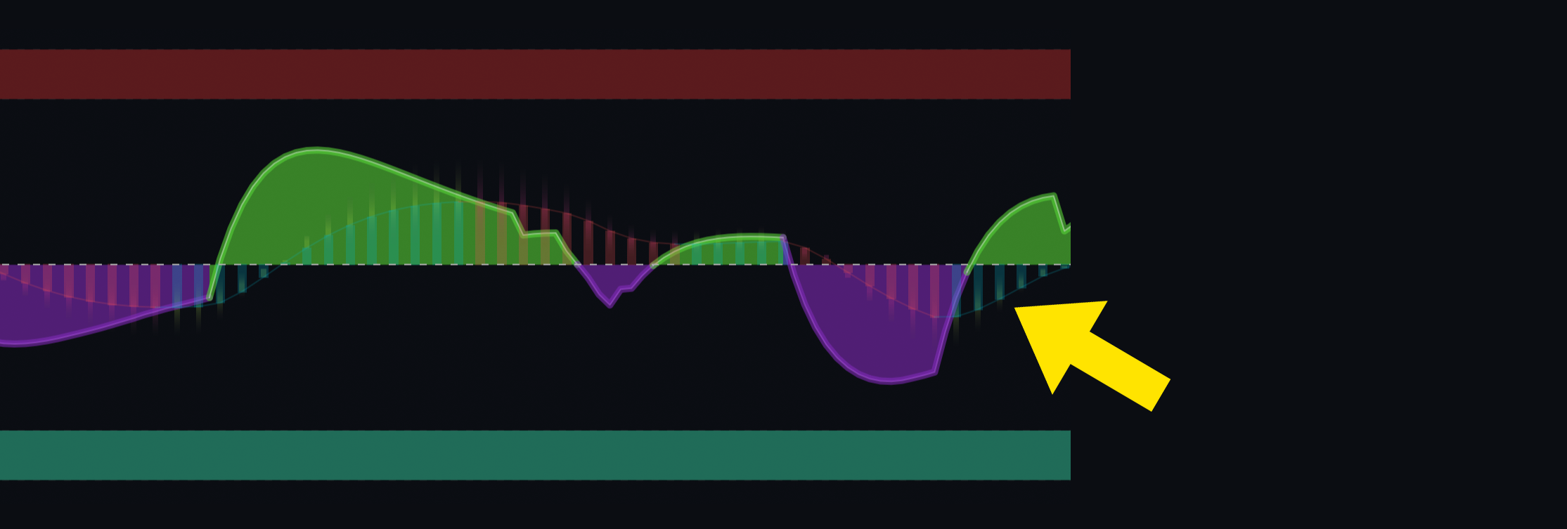
TradeIQ Oscillator
The TradeIQ Oscillator is an advanced toolkit combining both predictive and trend-following methods.
There are two main components and oscillators: the primary foreground one in purple and green, and the secondary green and red one behind.
The main oscillator displays bullish and bearish waves in the market and can predict reversals. Using this to aid in trend identification can be beneficial, but it’s important to note that the oscillator can move against the current trend. This behavior suggests that the market is moving in one direction but is likely to reverse after the next wave.
 |
|---|
| Trade IQ Oscillator displaying Bullish and Bearish Waves |
The background oscillator is more classical and trend-following. A green bar suggests an uptrend, while a red bar indicates a bearish trend. If the histogram is above 0, it signals an uptrend, and if it is below, a downtrend. However, if the histogram is above 0 but turning red, it suggests a loss of momentum and a possible reversal shortly. Using both oscillator components can create a powerful pairing.
 |
|---|
| Trade IQ Oscillator Histogram |
Using this in conjunction with the more predictive foreground oscillator allows traders to trade both predictively and reactively.
The settings for the oscillator allow automatic divergences to be enabled, and overbought and oversold zones can be shown, providing additional suggestions on when the market might reverse.